How to Choose Grout Colour for Porcelain Tiles
A practical grout-colour guide explaining matching versus contrast, marble and stone designs, maintenance perception, sample boards and joint-width effects.
Grout colour controls how strongly the tile grid appears
The same porcelain design can look continuous, graphic or highly modular depending on grout colour. A close match can reduce joint contrast, while a contrasting grout can emphasize each tile and the laying pattern.
Colour selection should be made with physical tile samples and, for important projects, a small cured grout sample. Screen colours and wet grout are not reliable substitutes for the final cured appearance.
Common grout-colour strategies
| Strategy | Typical visual result | Consider |
|---|---|---|
| Close match | More continuous field | Tile may still contain multiple tones |
| Soft contrast | Defines the module gently | Joint width becomes more visible |
| Strong dark contrast | Graphic grid | Edge/joint inconsistencies can stand out |
| Warm neutral | Supports beige/cream palettes | Room lighting can shift perceived undertone |
| Cool neutral | Supports grey/stone palettes | Warm lighting can change perception |
Match the dominant field colour, not necessarily every vein
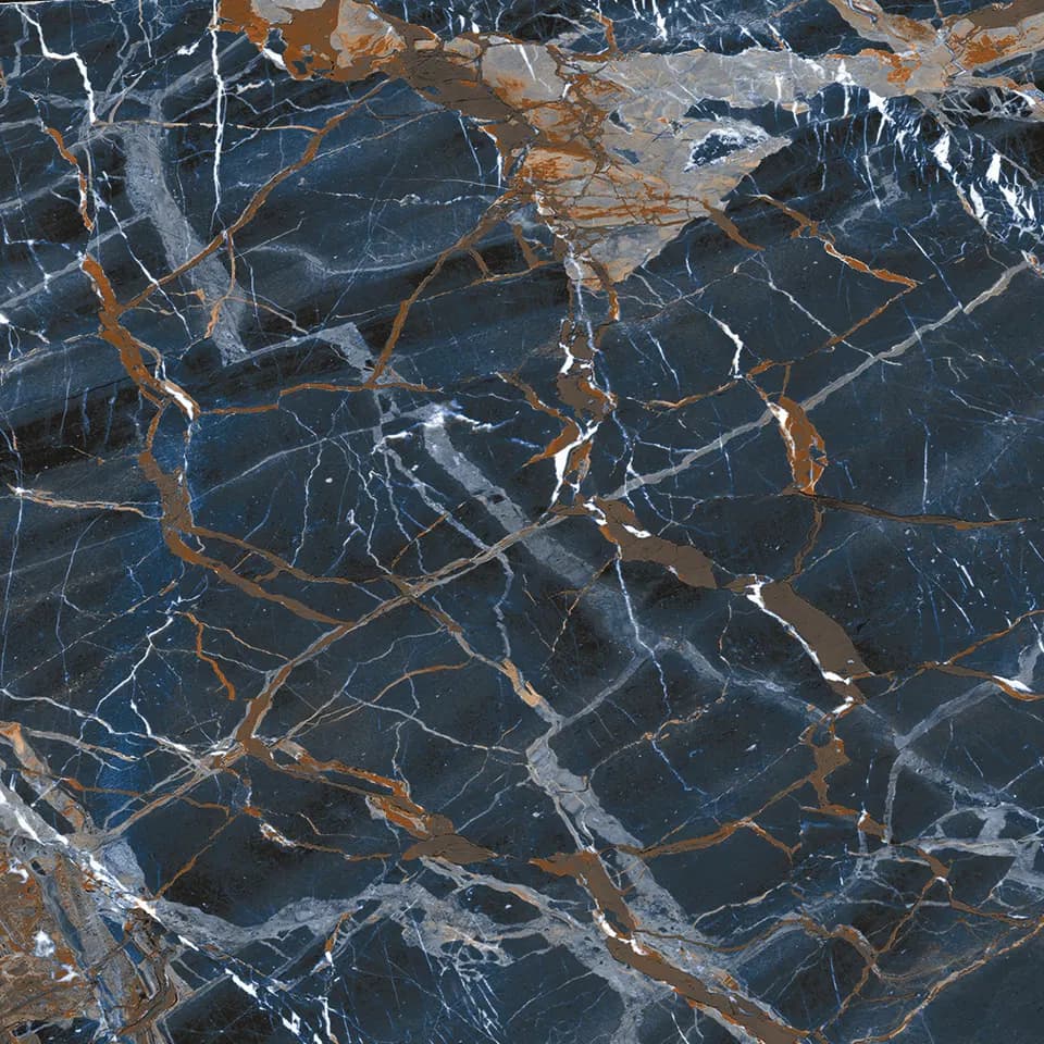
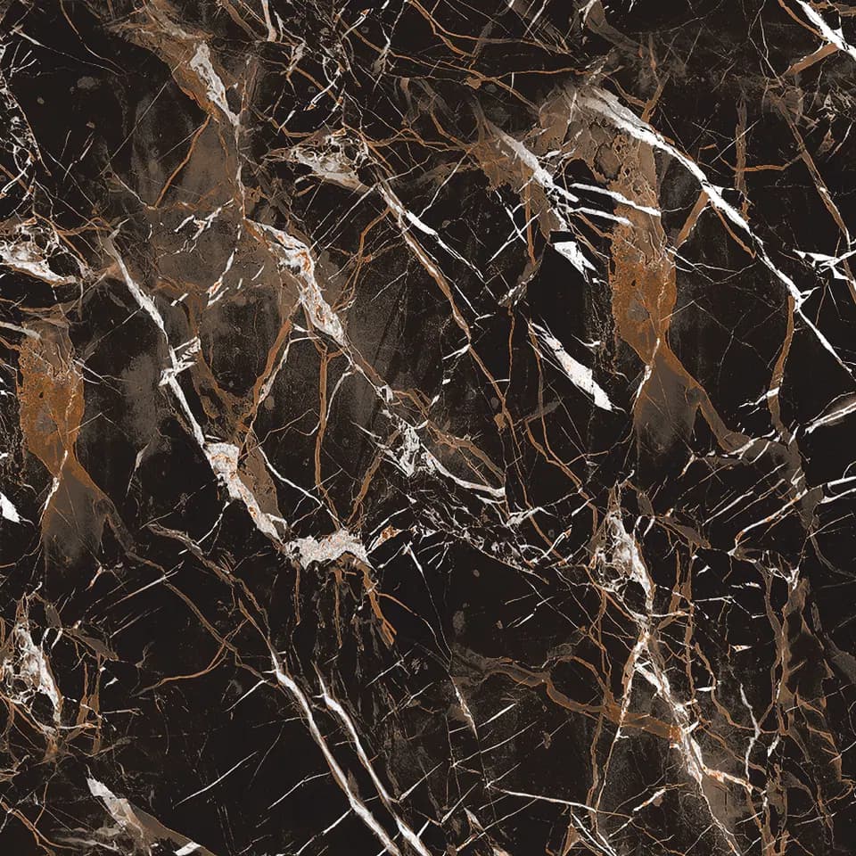
Marble- and stone-inspired tiles can contain several colours. Matching grout to one dark vein may create a much stronger grid than expected. Start with the dominant background colour, then decide whether the design needs more or less contrast.
For directional or bookmatch-style visuals, the grout should support the planned composition rather than becoming the strongest element.
Joint width changes colour impact
A wider dark joint around a pale tile has more visual impact than a narrow, colour-coordinated joint. Physical joint width must be established from technical requirements first; colour is then used as a design tool within the appropriate joint.
Do not reduce spacing below what the actual tile variation and installation system can accommodate simply to make grout disappear.
Visible cleanliness and technical cleanability are different
Dark grout can disguise some everyday soil but may show mineral deposits or light residue; very pale grout can make some contamination more visible. Grout chemistry, sealing where required and the cleaning regime have more influence on technical maintenance than colour alone.
Choose a grout system for the service condition first, then choose a suitable colour within that system.
Build a sample when contrast or texture is strong
Textured tile can retain grout residue differently from a smooth glazed surface. A sample board allows the installer to test cleanup technique and lets the designer view the cured joint under project lighting.
This is especially useful for strong contrast, white grout, black grout and pronounced surface relief.
Should grout match the tile exactly?
No. A close match reduces grid contrast, while a contrasting grout intentionally emphasizes tile shape and layout.
Does dark grout stay cleaner?
It can hide some soil but may reveal other residue. Maintenance depends on grout chemistry, sealing and cleaning, not colour alone.
Should grout colour be chosen before joint width?
No. Establish an appropriate physical joint from the tile and installation requirements first, then evaluate colour.
Why can cured grout look different from a colour chart?
Water ratio, curing, lighting, surrounding tile colour and the chart medium can all affect perceived colour. Use a physical sample for critical work.
Continue with product-specific information
Use TAG Ceramic product pages, technical resources and current packing information to confirm the exact design before ordering or project approval.
Browse Tile DesignsGrout Joint Width for 600×600 Porcelain Tiles: Planning Guide
Continue with the complete TAG Ceramic guide for this topic, then use product pages and current technical data for the exact design being considered.
Open complete guide